-
The all new FR24 looks great! Notable improvement: the airport filter.
Thanks Mike & all who contributed.
bga1Leave a comment:
-
First class keep up the good work.I like the markers for the airports better the x marks the spotLeave a comment:
-
Hi Dennis and Mike.
Got it working now, i had forgotten to click on 'Aircraft labels' ( Doh!! )
Leave a comment:
-
250+ aircraft = no labels

less than 250 aircraft = labels

Zoomed in - 3 rows

Leave a comment:
-
I tried it using Chrome, the Filter worked for Airport but no label for callsign.Originally posted by DennisC View Post
12 Planes showing on the map and zoomed in, no labels.
I have just cleared the cache and cookies and did not make any difference.
Mike / SpeedbirdLast edited by speedbird1960; 2012-03-13, 08:15.Leave a comment:
-
Labels is no difference from today's version
Labels will be displayed when there are
less than 250 planes on map.
Row #2 and #3 will only be displayed
when zoomed in.Leave a comment:
-
In the airplane label I choose altitude&speed in row 2 and to/from in row 3 but none of them appears on the map.
I use Firefox as my web browser.Leave a comment:
-
http://beta.flightradar24.com/ has been updated with some new design and features. Settings and filters now opens in new windows. You can add to/from as aircraft label. Playback control has improved. We plan to release the beta as the official version of Flightradar24 later this week!

Leave a comment:
-
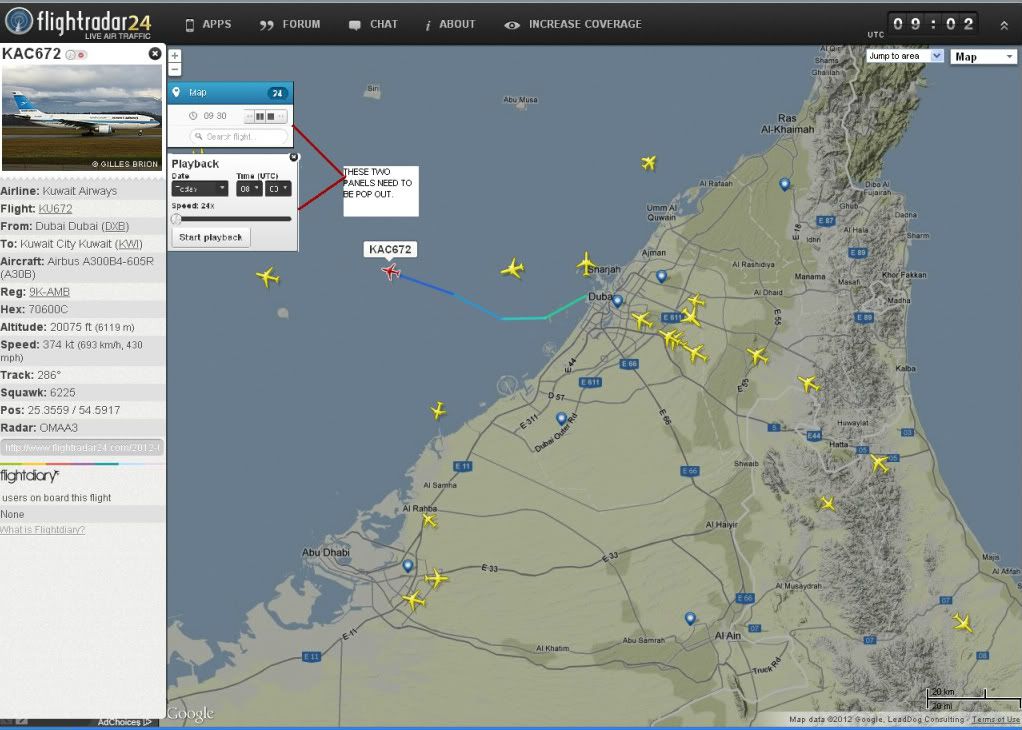
I think that there needs to be two 'pop out panels' like the ones illustrated below, because if you have selected an Aircraft you can not pause playback / advance or rewind the time or adjust the speed of playback without losing the Aircraft you where tracking. (Also you can not alter the playback speed without having to stop playback which results in losing the Aircraft that you where tracking.)
Or another option could be to have a minimize feature for the panel with the Aircraft photo and information on it.
The minimize feature could also incorporate the Padlock feature suggested by Online4 in post #10.
"There should be some icon (maybe padlock), which could lock left panel. Now, when we surf through all airplanes, left panel (with airplane informations) is opening and closing all the times. It is little bit annoying."
 Last edited by speedbird1960; 2012-03-02, 00:56.
Leave a comment:
-
I agree with that. White color on black background distracting eyes.Originally posted by OFBleeker View Post
And one more suggestion:
There should be some icon (maybe padlock), which could lock left panel. Now, when we surf through all airplanes, left panel (with airplane informations) is opening and closing all the times. It is little bit annoying.
But all other stuff on beta version is simple the best!
Leave a comment:
-
FR24 team, Excellent!
One suggestion (and I think it was mentioned by Hamish) the panel at left showing aircraft/flight details is now white with black characters, whereas it used to be dark with white characters; I think the original color scheme was better (the white panel is very bright and it makes it more difficult to keep track of other things). All else very nice indeed!Leave a comment:
-
Looks very good
Leave a comment:
- IMPORTANT NOTICE! Before you post on Flightradar24 forum you must read this important information about Flightradar24
Copyright (c) 2009-2019 by Flightradar24
Powered by vBulletin®
All times are GMT. This page was generated at 07:24.
Working...
X
We process personal data about users of our site, through the use of cookies and other technologies, to deliver our services, personalize advertising, and to analyze site activity. We may share certain information about our users with our advertising and analytics partners. For additional details, refer to our Privacy Policy.
By clicking "I AGREE" below, you agree to our Privacy Policy and our personal data processing and cookie practices as described therein. You also acknowledge that this forum may be hosted outside your country and you consent to the collection, storage, and processing of your data in the country where this forum is hosted.
Leave a comment: